Web Application to Help Nonprofits Accept Complex Donations
The Mission
Our goal was to research and design a web application that serves to help nonprofits accept complex donations. The sponsor of this project is currently responsible for connecting donors and nonprofits and conducts forms of project management himself. His vision is to translate day-to-day work into an online process that educates, connects, and assists nonprofits with complex donations.
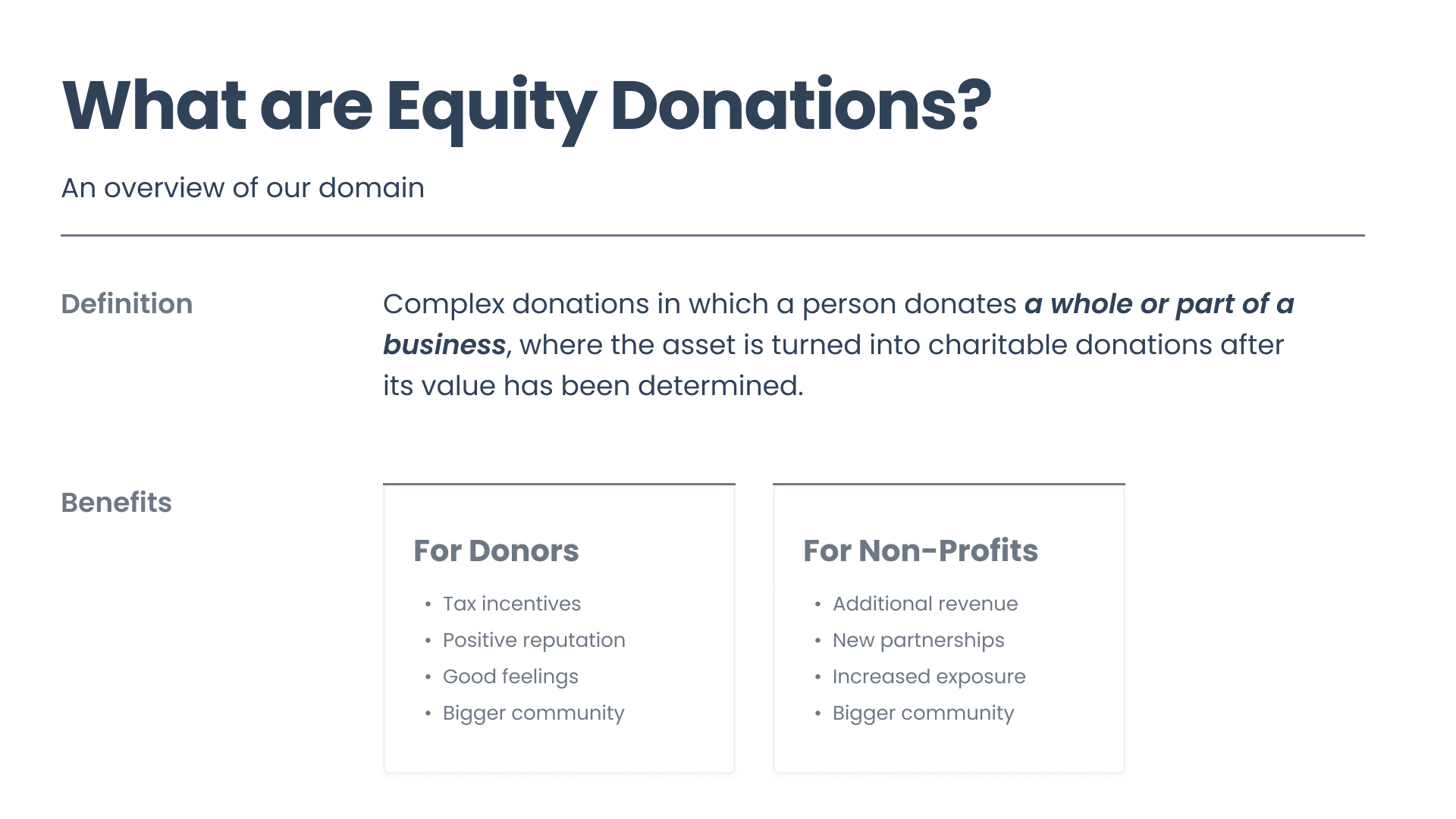
What are complex donations?
Our team prioritized our initial research and discussions with our sponsor, as this problem space was unfamiliar with us. We learned that complex donations have a donor that gives a part or whole of their business to a nonprofit. The process for accepting this form of equity involves more stakeholders, such as lawyers and evaluators, as the business’ value must be assessed and agreements must be handled by legal professionals.
My Contribution
Within our team of 9 UX students, I was one of a few who had experience with sponsor-led projects. I used this to help guide younger team members, keep our team updated with progress from smaller group work, lead meetings with sponsor and interviews with nonprofits, and contribute towards UX writing. I valued the collaborative nature of our team’s work, both within and through our sponsor/users.
Guiding our Direction
Sponsor
Our sponsor played a vital role in helping our team understand the problem space we were given. The process of complex donations was a niche area, as not many online resources had information that could help our team. Our team made it a priority to gain his involvement within our process of design. His expertise with handling these donations proved instrumental in informing our iterations towards designing the web application.
Nonprofits
We reached out and connected with several nonprofits, ranging from small to medium sized organizations, to see what they knew about complex donations and if they have had experience in managing them. From our interviews, we identified an overall lack of awareness and knowledge surrounding this area of complex donations.
Most of the nonprofits did not know what complex donations were.
This takeaway highlights the problem that our users won’t use a web application for accepting a type of donation they know nothing about.
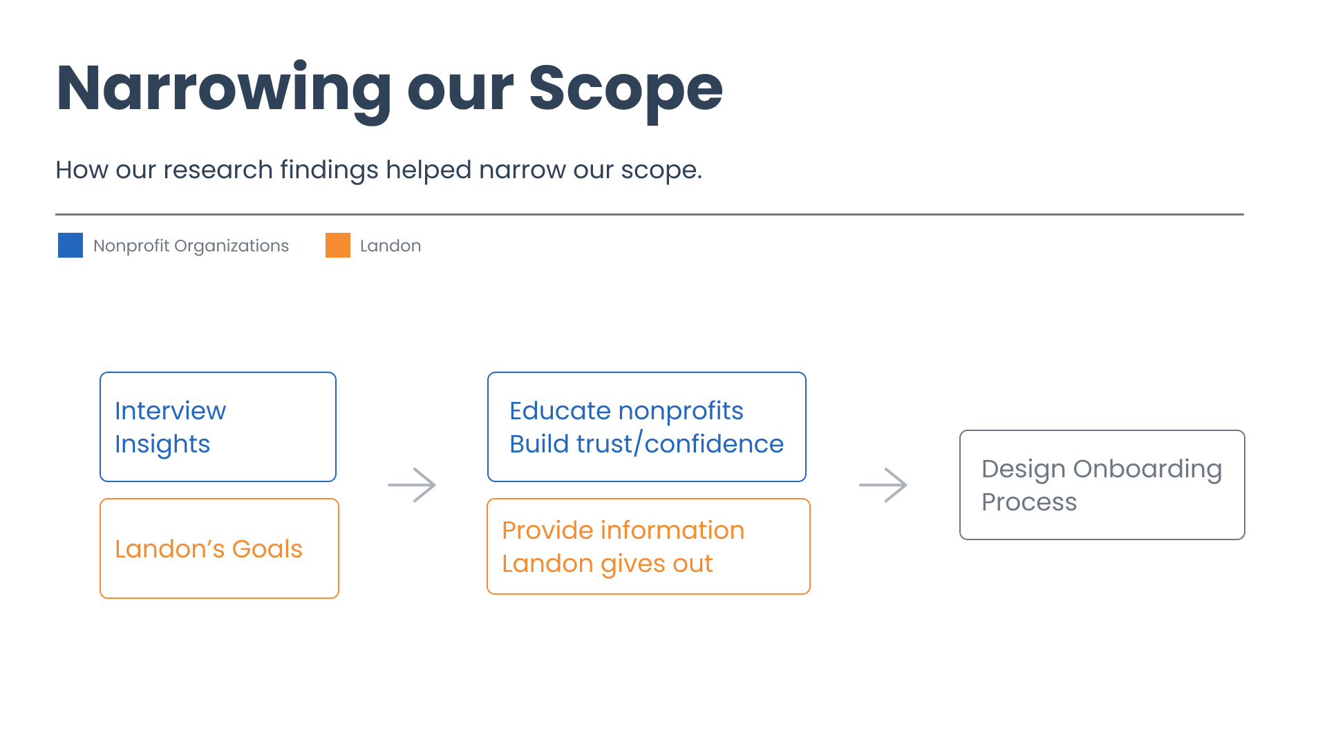
The need for information directed us towards focusing on creating an onboarding process that aimed to educate, establish trust, and build confidence.
Our Approach
Comparative analysis greatly helped us reach our goals of education, trust, and confidence building in the onboarding process. By researching other sites that served our nonprofits, we gained inspiration towards how we could format and tailor information within our designs. Our focus on informing nonprofits, as a result, placed a great emphasis on UX writing.
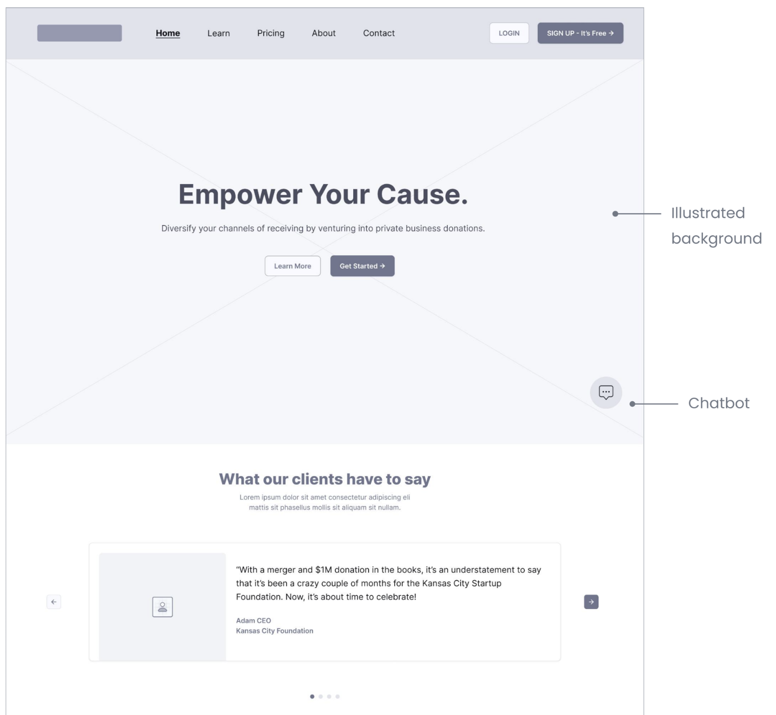
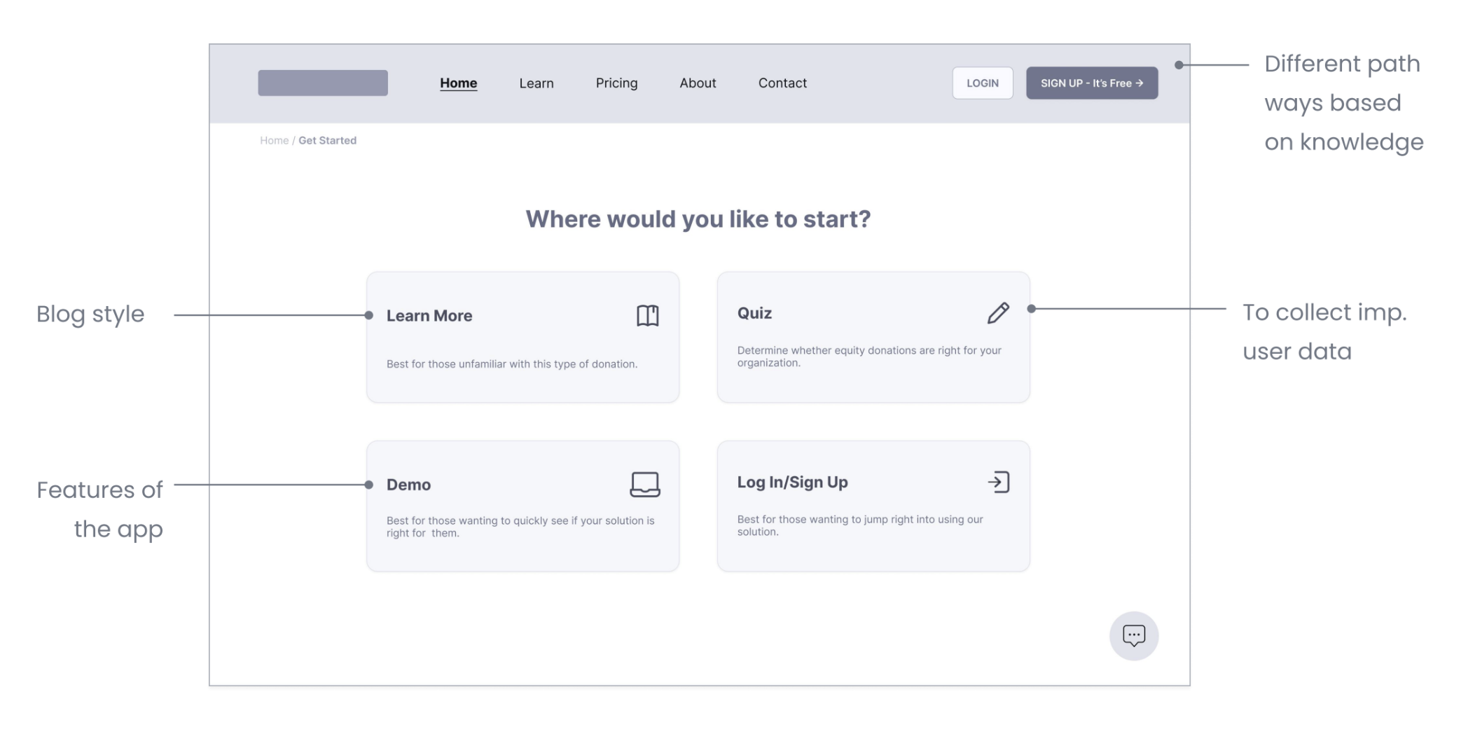
For our project timeframe, we split our designing of screens into 3 categories: education, confidence/trust building, and the sign-up experience. This helped our team divide and conquer so that we could provide a more fleshed-out onboarding experience and focus upon the goals we highlighted.
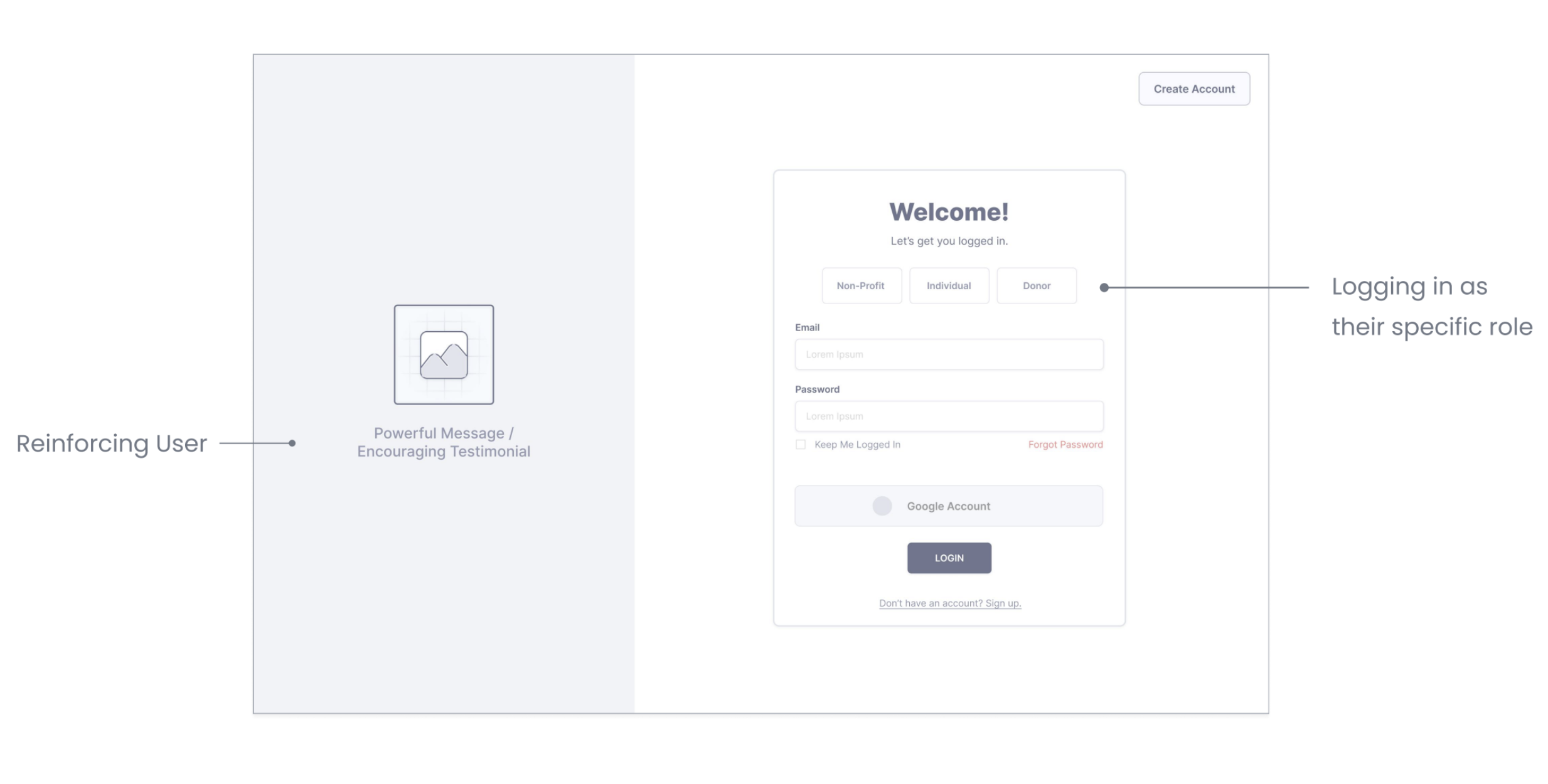
Below are some key frames that showcase the features for our web application:
The Difference
The feedback we received from our sponsor and nonprofits highlighted how our team identified our users’ need for information and used that to inform our direction towards an onboarding process. Our interviewees were interested in learning about new methods of giving that would benefit their nonprofit cause. Overall, our team felt the most impact when talking with nonprofit leaders and gauging their excitement for the future of this web application.